Grading the PWHL's new names and logos
The wait is over. A year after the PWHL's inception, the league announced the names of its "Inaugural Six" franchises ahead of the 2024-25 season.
The league didn't want to rush the naming process in the short timeline between its June 2023 founding and Jan. 1, 2024 puck drop, so it opted to use only city and state names in the inaugural season.
Now, after a process that was still admittedly quick, the names and logos are ready. "Most teams take 18 months to build out a team logo or a team name. We decided we were going to do six in nine months," said Amy Scheer, senior vice president of business operations.
The condensed timeline was influenced by the desire to make jerseys available for fans prior to the start of the second season, set to kick off in November.
"Jersey artwork was really the driving factor of this because we wanted to make sure we would have jerseys ready for the start of the season to reflect the updated identities," said Kanan Bhatt-Shah, the league's vice president of brand and marketing.
PWHL looked to a creative agency called Flower Shop for help with the team identities, a process Scheer said started on day one of the league itself. "We really started collecting insights and feedback from our general managers, our players, and, of course, over the course of the season, our fans," she said.
Do these new identities make the grade? Here, theScore's Jolene Latimer and Kyle Cushman break down what's good and what's not about each team name and logo.

Boston Fleet
The logo is meant to evoke movement - that of "sailing toward victory" with the slanted "B." Juxtaposed with this is the outline of an anchor - a nod to Boston's maritime past, which is also the inspiration for the team name. "We really wanted to combine that with the spirit of the people, the spirit of Bostonians and New England - this resilience, unity, and that spirit," Bhatt-Shah said.
What I'm liking: Boston's brand is togetherness, and the concept of an armada certainly evokes that. The logo itself is one of the league's most modern and visually appealing. Beyond the "B" logo itself, I think the way the team's name is stylized in its full version is strong and compelling.
What's not working: I would have liked to see more of a tie-in to women's history, or women's sports history. While the concept of including local maritime history is nice, overall it feels like a bit of a missed opportunity to tell a more elevated story with the naming. - Jolene Latimer
Grade: B+
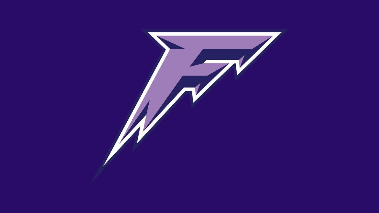
Minnesota Frost
This logo leans hard into the weather, with cold imagery hidden throughout. The slanted "F" is designed to look like icicles in motion and the "dimensional form" represents the "harsh beauty of Minnesota's winters." The sharp edges and points are also temperature-related - said to show "cold precision." "It's such a strong, bold, intense logo that I think a lot of people are very excited about, including the players," said Kendall Coyne Schofield.
What I'm liking: The logo itself looks cool, even if the explanations behind its anatomy are prosaic. I can see this logo working well on a lot of different merchandise. I like its built-in dimension, which is itself a bit of a departure from the flat logo designs that teams and brands have favored in recent years.
What's not working: Building a hockey logo on the idea of winter weather is not necessarily groundbreaking. Conceptually, this logo and name combination doesn't do it for me. - Latimer
Grade: B-
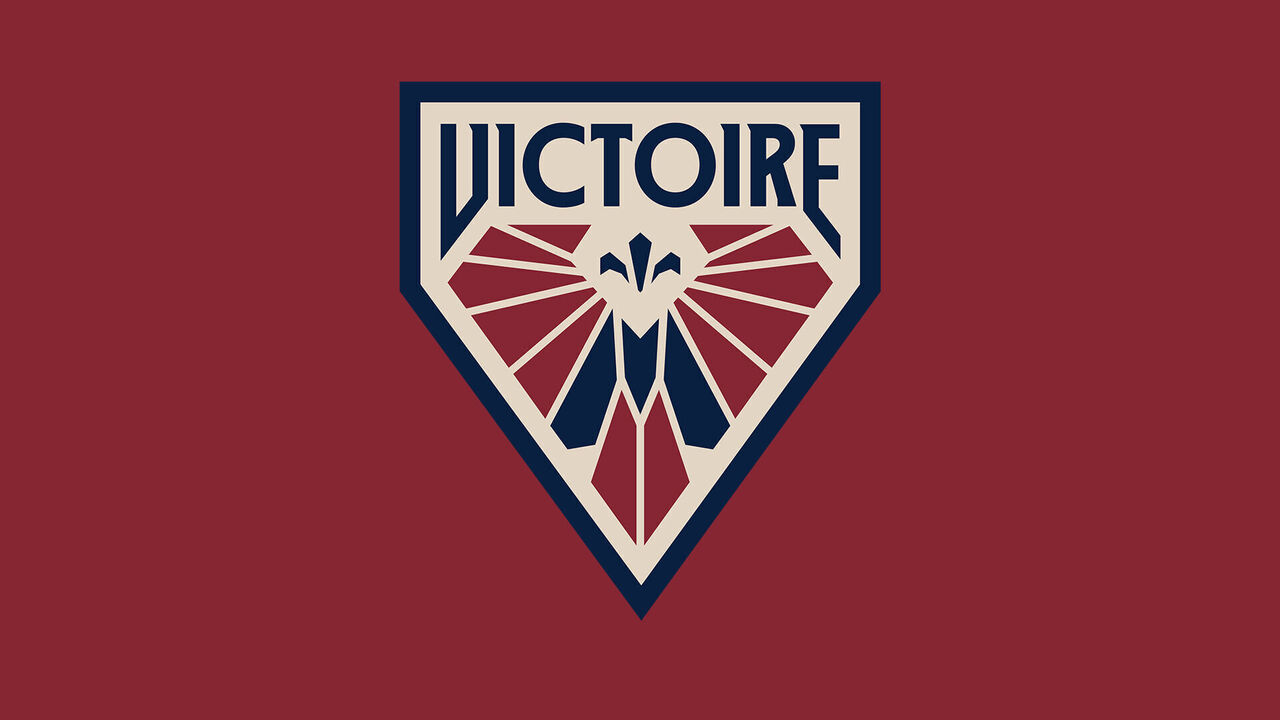
Montreal Victoire
The logo is designed to project a "spirit of victory" and is rich with symbolism. "It's going to be a mindset," said Montreal captain Marie-Philip Poulin. "It's going to be what the team's going to rally around, what the city's going to rally around, and what our fans are going to be all about."
What I'm liking: I'm loving the crest approach with this logo, and the hidden nods within it. The "Wings of Triumph" symbolize the goddess of victory, and the hidden "M" using the team's secondary colors represents Montreal. The fleur-de-lis above it is likewise a nod to Quebec. This logo hits all the right notes to blend history, legend, and the ideals of sport. The name itself is somewhat on the ambiguous side, but for a city like Montreal that works just fine.
What's not working: I think future iterations of the logo that look more polished will elevate the feel of the team and league. This logo is a strong start but still feels a bit lackluster when compared to logos of other professional sports teams in North America. - Latimer
Grade: A
Ottawa Charge
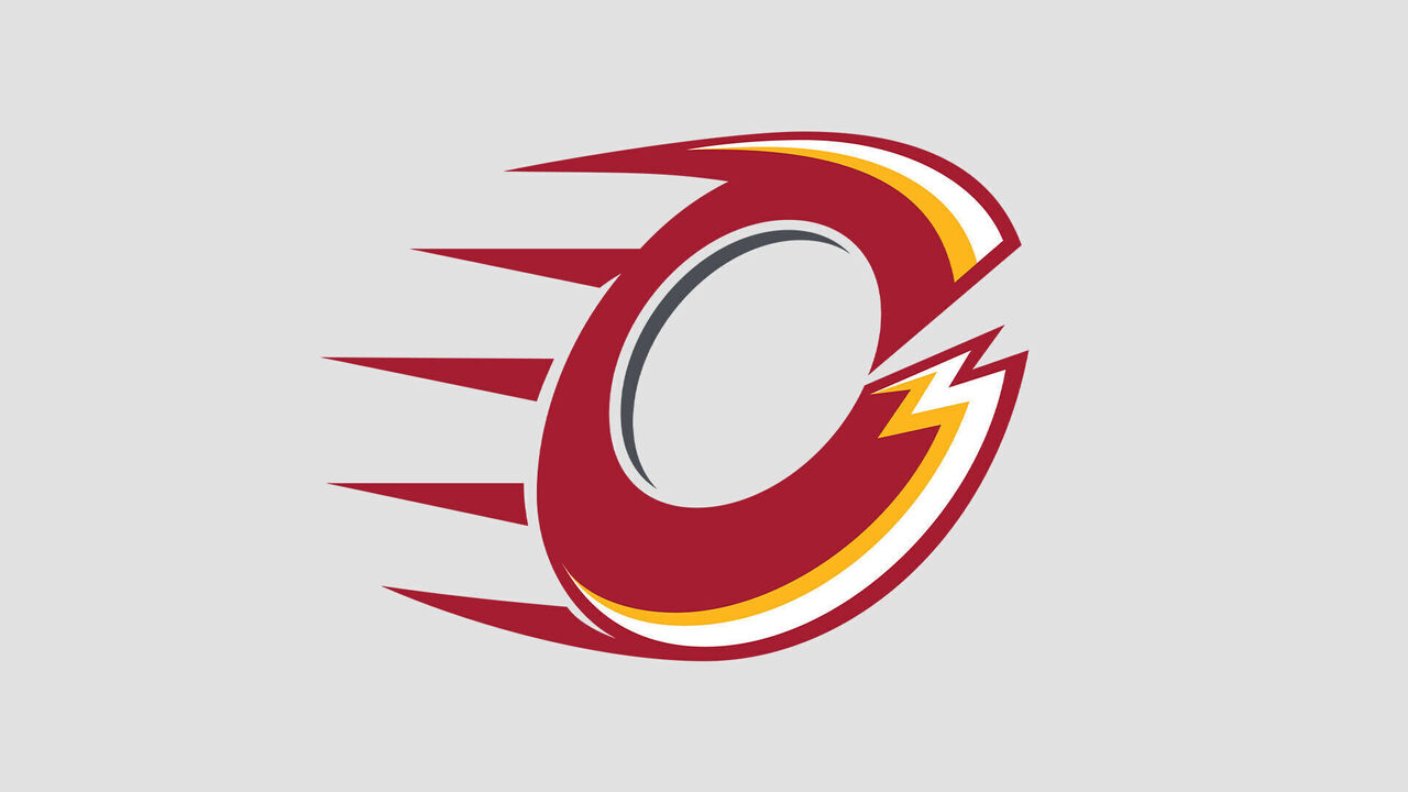
The Charge logo is a styled "C" that not only represents the team name but also the city with the hidden "O" in the middle. "It's not just a nod to the city, being the center of government, but it's a nod to our fans as well," captain Brianne Jenner said. "And I hope our fans realize that and embrace that. The electric energy they brought in our first season is a bit part of our identity."
What I'm liking: The dark red, yellow, and white is a classic combo that blends well with the Ottawa Senators but is different enough to not copy the color palette. The "C" logo creating an "O" in the middle is a nice touch.
What's not working: The logo looks like a mashup of the Calgary Flames and Cleveland Cavaliers. So much effort from the league went into choosing unique names, only to have a logo that closely resembles two major teams. "Charge" is inspired by the city motto, "Advance - Ottawa - En Avant." It's ultimately a fancy synonym. The trademarked name from last year - "Alert" - at least has a history in the city dating back to a women's hockey team from the 1920s. This one's a miss. - Kyle Cushman
Grade: D
New York Sirens
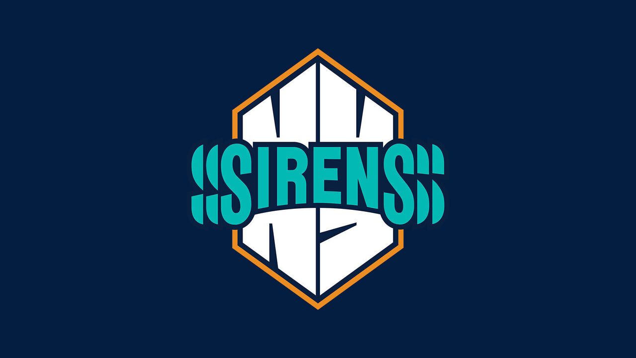
Sirens is "an ode to New York City's one-of-a-kind energy, pace, and rhythm," the league said. "The fact that (all New York women's teams are) repping a different version of teal is pretty cool," captain Micah Zandee-Hart said. "Obviously, in women's sports, we're all one right now. ... It's cool to feel like we're tied into some of the other teams in a way, and I'm sure fans feel the same."
What I'm liking: The teal is superb. It's an obvious choice for New York and matches the WNBA's Liberty and NWSL's Gotham FC. The "NY" letterform not only resembles city architecture but brings the logo together to resemble a goal horn. Even if the logo feels more basketball than hockey, it's a strong pick for New York. The "Sirens" name, meanwhile, simply works for the city.
What's not working: The "S" soundwaves are a fun idea, but they make the logo busier with no real benefit. You won't lose anything by dropping them and making the logo cleaner, though part of the reason they're there is to represent the busy energy of the city. - Cushman
Grade: B
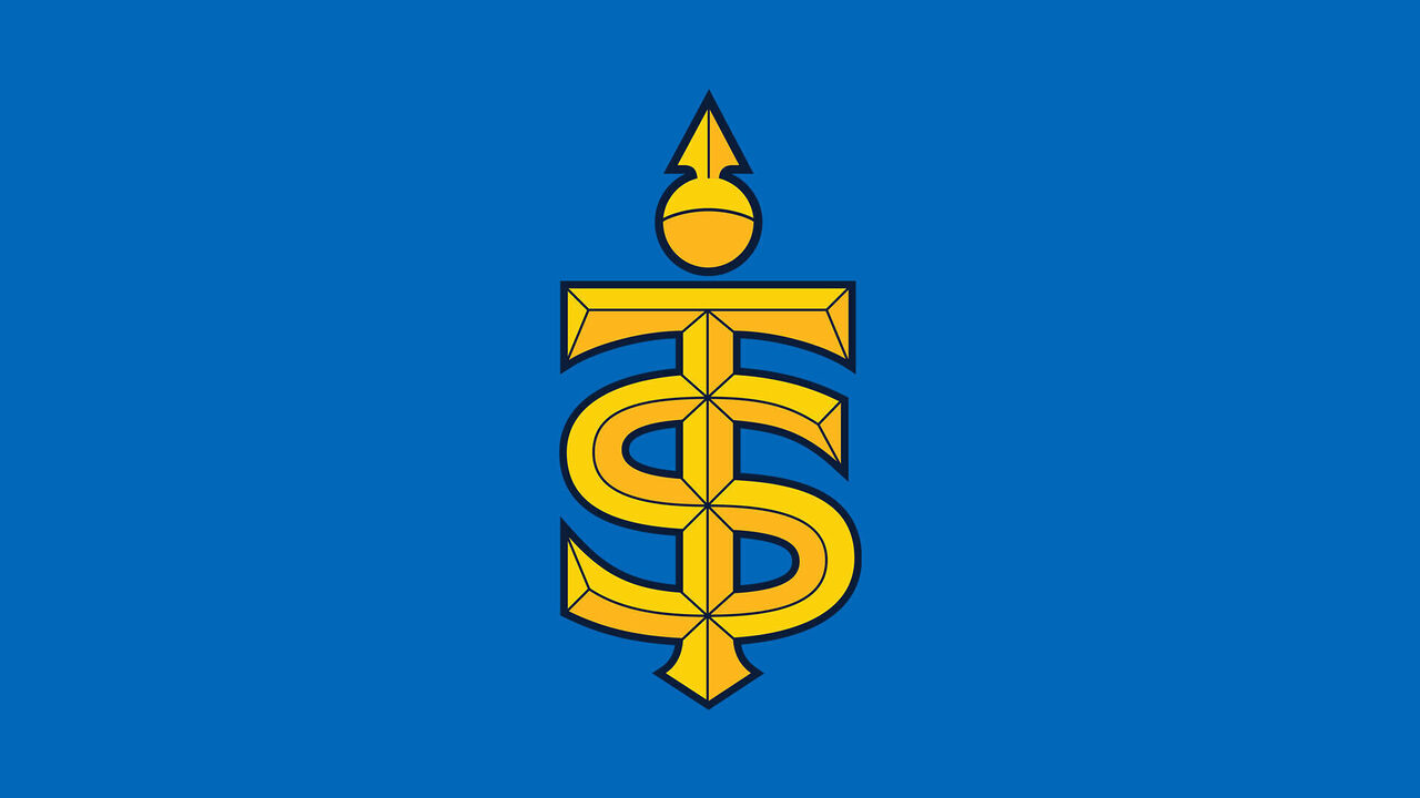
Toronto Sceptres
The Sceptres' logo is a monogram that intertwines the "T" and "S" of the city and team name. "There's a lot of tie-ins to the city, a lot of tie-ins to our team identity and how we want to perform on the ice," captain Blayre Turnbull said. "Overall, I think it's a very fitting name and one that our city will embrace."
What I'm liking: The Toronto blue was a hit last season and is complemented well by the yellow logo. The primary blue ties into the classic Toronto palette while presenting a different flair with the added yellow. The name itself - Sceptres - is a unique choice that will grow on the fan base over time. Players are already embracing the moniker on social media, and "Sceptres" makes for potential post-game fun.
What's not working: The logo's resemblance to one used by Taylor Swift in a music video speaks to the high-school vibes that the Sceptres' emblem gives off. The league didn't want to use established names, which made royalty options like Reign, Royals, and even Monarchs no-gos. Sceptres comes across as an available name chosen to fit a specific theme, and, as a result, lands a little flat. - Cushman
Grade: C+
HEADLINES
- Colleagues reflect on the incredible life of Bob Uecker
- Without Morant, Grizzlies hand Spurs their largest loss of season
- Butler on trade rumors: 'Sooner or later, the whole truth will come out'
- Hornets' Miller out indefinitely with torn wrist ligament
- Tatum, Celtics snap out of shooting slump in win over Magic